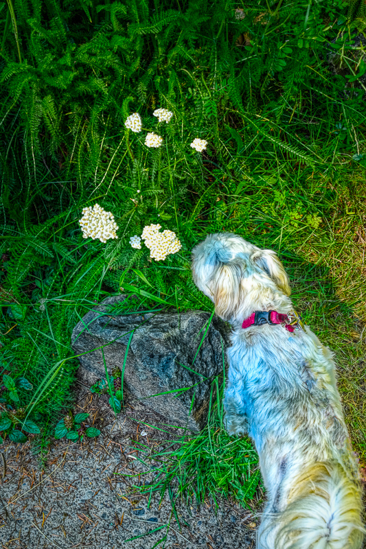
Edited in Studio. Following on Taylor’s Dehaze tutorial, I find that I am often starting my editing in Studio with Dehaze. It tends to add a perfect amount of punch. Like everything else, the main thing for me is to not overdo it.
Edited in Studio. Following on Taylor’s Dehaze tutorial, I find that I am often starting my editing in Studio with Dehaze. It tends to add a perfect amount of punch. Like everything else, the main thing for me is to not overdo it.
For reasons I’ve mentioned, I find the subject of this image enjoyable. I would suggest masking out the furbaby tho, in my opinion, the blue splotches in her fur are distracting.
@john4jack-- Eleanore has a point about the fur colour - looking at the grass to the right of the image - that is yellow-ish so I guess you have a Colour Temperature problem from mixed light sources(?) and DeHaze will really mix things up. I think you need to return to the original and sort out the colour balance before you mess around with ANY plugins no matter how good you believe them to be

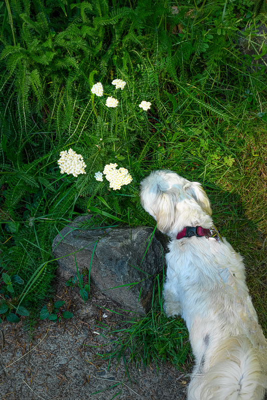
Here is the original prior to any editing. The dark spots on her left rear are where there is almost no hair. The dark is the color of her skin. The second one is a re-edit. That’s a very realistic version of Lizzie. The purpose of the image was to express the title.
Then you may need to think.
You now have better representation of the animal - your first one was a little “off the mark”
There is no problem with her natural hair coloring or lack of. What I am seeing on the original appears to be shadows from the rock and blossoms, only identifiable on close inspection, that are magnified by the processing and take on the blue coloration… Masking her from the other adjustments would keep her appearing natural.
This is another approach I would try if I wanted to make them less prominent.
Many shadows can be made more manageable using the shadow reducing adjustment most editors have.
More work but I’ve gotten good results if that doesn’t work or takes too much out of other areas, something that will work lightening shadows on white fur at least…make two duplicate layers of the original. desaturate the second one, keeping the untouched duplicate layer on top, erase the shadowed area and the less intrusive desaturated area will take its place.
The second edit helped in removing most of the blue color on Lizzie. If you use Photoshop you may want to use the Hue/Sat adjustment and lower the blue slider or maybe color correct with playing with the color temperature in Studio and try adding more warmth? Just some thoughts.
Thank you. Much of what you suggested was done, especially with the re-edit.
