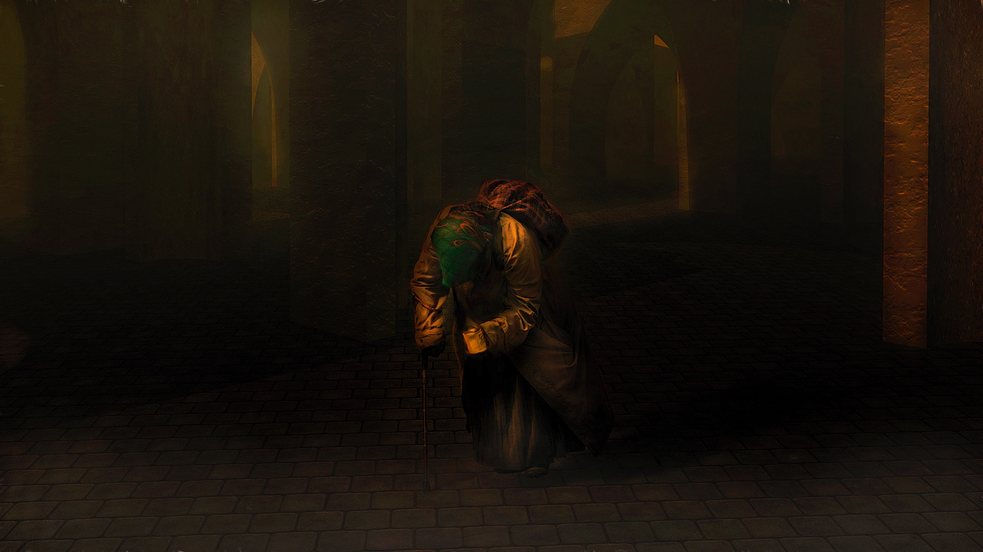
Late at night a lonely soul stills wanders. Roma.

4 Likes
The image is very dark on my screen, but it appears to be a very nice image?
1 Like
Thank you!!! I have a new monitor and this Dell is kind of light on the shadows, I noticed that in my phone the image was much darker. I am off from work so I am unable to check it.Let me open up the shadow a bit more.

It is a very nice image, but even the second version is fairly dark.
1 Like
Yeah, I think this image has great potential - just let us see it.
1 Like
The second version is slightly better, but still on the dark side and hazy looking.
Have you tried DeHaze (it will change the tones) and maybe use a Basic Adjustment (exposure etc) in Studio?
You can also enhance the image further with maybe using Details etc.
I played around a little and got this result (I hope you don’t mind?) using Dehaze and Basic Adjustment and some minor tweaks using Precision Detail.
Of course you can use anything you like to fit your personal tastes… maybe a little darker?

2 Likes
That is a very powerful and moving image. I prefer the second image.
1 Like
Here’s how I see it. Again, this is a great image. As they say, beauty is the eye of the beholder. And then there is the issue of monitor calibration etc. And it is interesting that I don’t see it after posting as I see it on my monitor prior to posting.
2 Likes
Hummm I think is the different calibration, in your version there is no mystery and what I thought made the image interesting was the fog and haze, I also noticed the change in the tones for a more standard color. I see what you mean, your approach is technically sound but to me it killed the mood. I really appreciate the effort you put in reworking it.
1 Like
Yes I see a more vivid and more contrast in your version, I feel like when I saw the new version of Pinocchio , I loved the warm hues of the original but some viewers preferred the cooler more saturated new version. Thanks for your time and input. Lots to think about.
I understand, my main concern was to try to bring in some more details to the person.
Your second revised image is perfect for the look and mood you were going for.
1 Like
I like the image too though the first is very dark the second is a bit better the third to bright maybe between the second and the third but more towards the second either way as you said beauty is in the eye of the beholder, but it is a great image.
1 Like
I really like this image, and the original version, when seen in my Photoshop is very nice. Here is one that I did from that version with some Topaz Adjust HDR Heavy Grunge processing, which gives a nice image on my monitor in PS and in Irfanview. I don’t think that you want to get rid of the haze and as long as there is a bit of structure shown in the floor, that seems enough. Again, I agree that preference has something to do with it but the problem with seeing the same thing on the web and on ones own monitor and viewer is tantamount. If this were to be printed I think that I would like either the original or your first retry best as it would definitely have mystery and require that the looker look very carefully.

2 Likes
Perfect!
1 Like
Great job!! I was planning to print this one and other photos in a Blurb book, it is going to be challenging since printing is another arena of discrepancies, this one has more punch and probably very well suited for printing.
