OHHO, thisis why I like running thru sites as these for testing grounds, the dang rocks are centered!
any other critiques mistakes you guys spot? ??/
thnkx
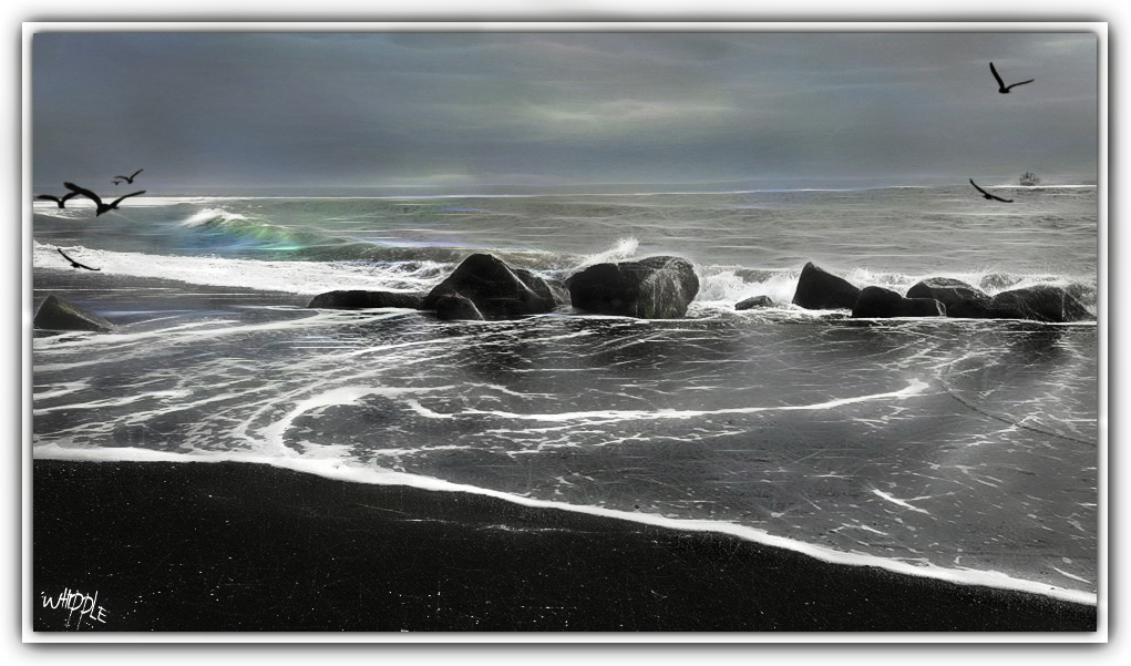
I don’t see it as a negative or a problem that the line of rocks roughly divides the image top to bottom, nor that the 2 big rocks are centered left to right. The two main lines - the main surf line and rocks and the thin foam line in the foreground - work well with the distant horizon. Even though the scene is of an active surf, I think the image portrays calmness due to its lowkey nature and the similar tone levels of the sea and sky. The line of rocks balances the quiet, smooth foreground wash against the sea and sky.
The only potential crop I see is just inside the wingtips of the birds on the left. That wouldn’t really change much with the centering of the rocks keeping the balance I mentioned, but it might add more visual mass to the birds and ship on the right. And the highlighted wave would still be in a nice position. Just my two-cent opinion.
Best regards
I don’t see any problems with your composition or edits, I like how the image looks. My only thought is… if the foreground is too dark with the lighting that is displayed in the image? Maybe opening up the shadows in the foreground a little? But then again, I like the contrasts portrayed.
centred or not ----that’s a fine composition — rule #1 is “there are no rules”
thank you all for your input(s), I listen, look and learn from all and everything
